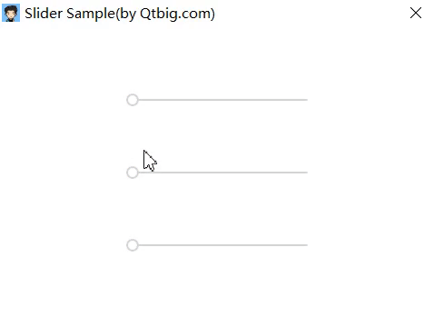
Qml的Slider控件示例 发表于 2019-03-04 通过自定义样式美化Slider 起始值0处标识同心圆; 拖动动画变化颜色; 气泡显示数值. 示例源码1234567891011121314151617181920212223242526272829303132333435363738394041424344454647484950515253545556575859606162636465666768697071727374757677787980818283848586import QtQuick 2.0import "../" as MyRectangle { width: 320; height: 240 Row { anchors.centerIn: parent spacing: 20 Column { spacing: 50 /* handle is rectangle */ Repeater { model: ["red", "blue", "green"] My.Slider { id: slider to: 100 handle: Item { width: 14 height: width Rectangle { width: 14 height: width radius: width/2 color: slider.position === 0 ? "#d5d5d5" : modelData anchors.verticalCenter: parent.verticalCenter NumberAnimation on width { running: slider.pressed; from: 14; to: 20; duration: 100 } NumberAnimation on width { running: !slider.pressed; from: 20; to: 14; duration: 100 } Rectangle { anchors.centerIn: parent width: 10; height: width radius: width/2 visible: slider.position === 0 color: "white" NumberAnimation on width { running: slider.pressed; from: 10; to: 14; duration: 100 } NumberAnimation on width { running: !slider.pressed; from: 14; to: 10; duration: 100 } } Image { anchors.horizontalCenter: parent.horizontalCenter anchors.bottom: parent.top width: 0; height: width smooth: true source: "./" + modelData + "_64_64.svg" NumberAnimation on width { running: slider.pressed; from: 0; to: 48; duration: 100 } NumberAnimation on width { running: !slider.pressed; from: 48; to: 0; duration: 100 } Text { visible: slider.pressed anchors.centerIn: parent color: "white" text: parseInt(slider.position * slider.to) } } } } background: Rectangle { width: 200 height: 2 radius: 2 color: "#d5d5d5" /* available rectangle */ Rectangle { width: slider.position*parent.width height: parent.height radius: parent.radius color: modelData } } } } } }} 源码地址1https://github.com/QtComponent/Slider.git