使用Qml的RadioButton与CheckBox控件修改而成。
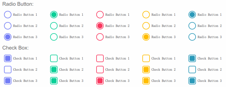
单选按钮
RadioButton代码
1
2
3
4
5
6
7
8
9
10
11
12
13
14
15
16
17
18
19
20
21
22
23
24
25
26
27
28
import QtQuick 2.0
import QtQuick.Controls 2.0
RadioButton {
id: root
property color checkedColor: "#0ACF97"
text: qsTr("RadioButton")
indicator: Rectangle {
x: root.leftPadding
anchors.verticalCenter: parent.verticalCenter
width: 26; height: width
antialiasing: true
radius: width/2
border.width: 2
border.color: root.checkedColor
Rectangle {
anchors.centerIn: parent
width: parent.width*0.7; height: width
antialiasing: true
radius: width/2
color: root.checkedColor
visible: root.checked
}
}
}RadioButton样式代码
1
2
3
4
5
6
7
8
9
10
11
12
13
14
15
16
17
18
19
20
21
22
23
24
25
26
27
28
GridLayout {
width: root.width
rows: 5
Repeater {
model: ["#727CF5", "#0ACF97", "#F9375E", "#FFBC00", "#2B99B9"]
Column {
spacing: 15
RadioButton {
text: "Radio Button 1"
checked: true
checkedColor: modelData
}
RadioButton {
text: "Radio Button 2"
checkedColor: modelData
}
RadioButton {
text: "Radio Button 3"
checkedColor: modelData
}
}
}
}
复选按钮
CheckBox代码
1
2
3
4
5
6
7
8
9
10
11
12
13
14
15
16
17
18
19
20
21
22
23
24
25
26
27
28
29
import QtQuick 2.0
import QtQuick.Controls 2.0
CheckBox {
id: root
property color checkedColor: "#0ACF97"
text: qsTr("CheckBox")
indicator: Rectangle {
x: root.leftPadding
anchors.verticalCenter: parent.verticalCenter
width: 26; height: width
antialiasing: true
radius: 5
border.width: 2
border.color: root.checkedColor
Rectangle {
anchors.centerIn: parent
width: parent.width*0.7; height: width
antialiasing: true
radius: parent.radius * 0.7
color: root.checkedColor
visible: root.checked
}
}
}CheckBox样式源码
1
2
3
4
5
6
7
8
9
10
11
12
13
14
15
16
17
18
19
20
21
22
23
24
25
26
27
28
GridLayout {
width: root.width
rows: 5
Repeater {
model: ["#727CF5", "#0ACF97", "#F9375E", "#FFBC00", "#2B99B9"]
Column {
spacing: 15
CheckBox {
text: "Check Button 1"
checked: true
checkedColor: modelData
}
CheckBox {
text: "Check Button 2"
checkedColor: modelData
}
CheckBox {
text: "Check Button 3"
checkedColor: modelData
}
}
}
}更多请关注公众号Qt君